-
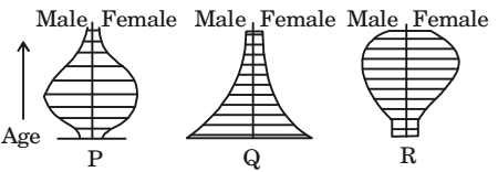
The age-sex compositions of three communities are represented by the diagrams P, Q and R as shown below.

Each of them implies a strong socio--economic characteristic as indicated below.
1. Aging community
2. Economically vibrant community
3. Multi ethnic community
4. Young community with high birth rate
Identify the correct set out of the following
-
- P - 4, Q - 3, R - 1
- P - 2, Q - 4, R - 3
- P - 2, Q - 4, R - 1
- P - 4, Q - 2, R - 3
Correct Option: C
How to Read an Age-Sex Pyramid Graph
An age-sex pyramid breaks down a country or location's population into male and female genders and age ranges. The left side of the pyramid graphs the male population and the right side of the pyramid displays female population. Along the horizontal axis (x-axis) of a population pyramid, the graph displays population either as a total population of that age or a percentage of the population at that age. The center of the pyramid starts at zero population and extends out to the left for male and right for female in increasing size or proportion of the population. Along the vertical axis (y-axis), age-sex pyramids display five-year age increments, from birth at the bottom to old age at the top.
Some Graphs Actually Look Like a Pyramid
Generally, when a population is growing steadily, the longest bars of the graph will appear at the bottom of the pyramid and will generally decrease in length as the top of the pyramid is reached, indicating alarge population of infants and children which declines toward the top of the pyramid due to the death rate. Age-sex pyr amids graphically display long-term trends in the birth and death rates but also reflect shor terterm baby-booms, wars, and epidemics.
The Three Types of Population Pyramids
1. Rapid Growth (looks more like an actual pyramid)
2. Slow Growth (looks more like a box)
3. Negative Growth (looks more like an invert pyramid)

